Visual Elements
c) Discussion of visual organizational choices created without images. How did you achieve a distinctive appearance and clear visual identity? (5 points)
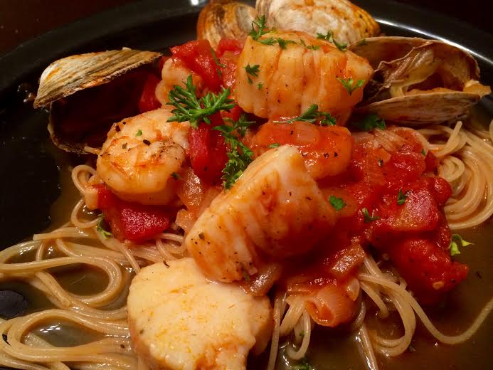
I think this evaluation best fits my blog. I have multiple photos on my header but only 2 in my blog so far. To create my distinctive appearance I chose Hemingway Rewritten for my theme because visually it is simple, clean, and straight forward. I liked that it allowed for a main picture at the top of the blog without overshadowing the title and tagline. After the blog critique class I tried to edit the size of the title box but could not figure out how. I do like when you scroll down on my page, the black title box fades away so that the whole image is shown. I chose 7 different pictures to randomly appear behind my title. They illustrate healthy food sources, exercise, and being active in general. Each time the reader changes pages the header picture changes. Readers will get a sense of my blog and my writings just from my title and imagery. My permanent pages are organized as “recipes” and “workouts”. These are two topics that I will reference a lot in my posts so I wanted to keep them separate. This also allows readers to scroll through each topic individually instead of reading through the posts. My “About” menu has two pages. The first page is my about me section and my disclaimers. The second page is a contact form so that if a reader has a question on any of my posts they can get in contact with me. In addition to the menu I have a search bar, tag cloud, and category widget to make navigated posts easier.
Extra 5 points can be added to “Organization and Structure” section on the grading rubric.